A LOCAL LANDMARK WITH DEEPER ROOTS

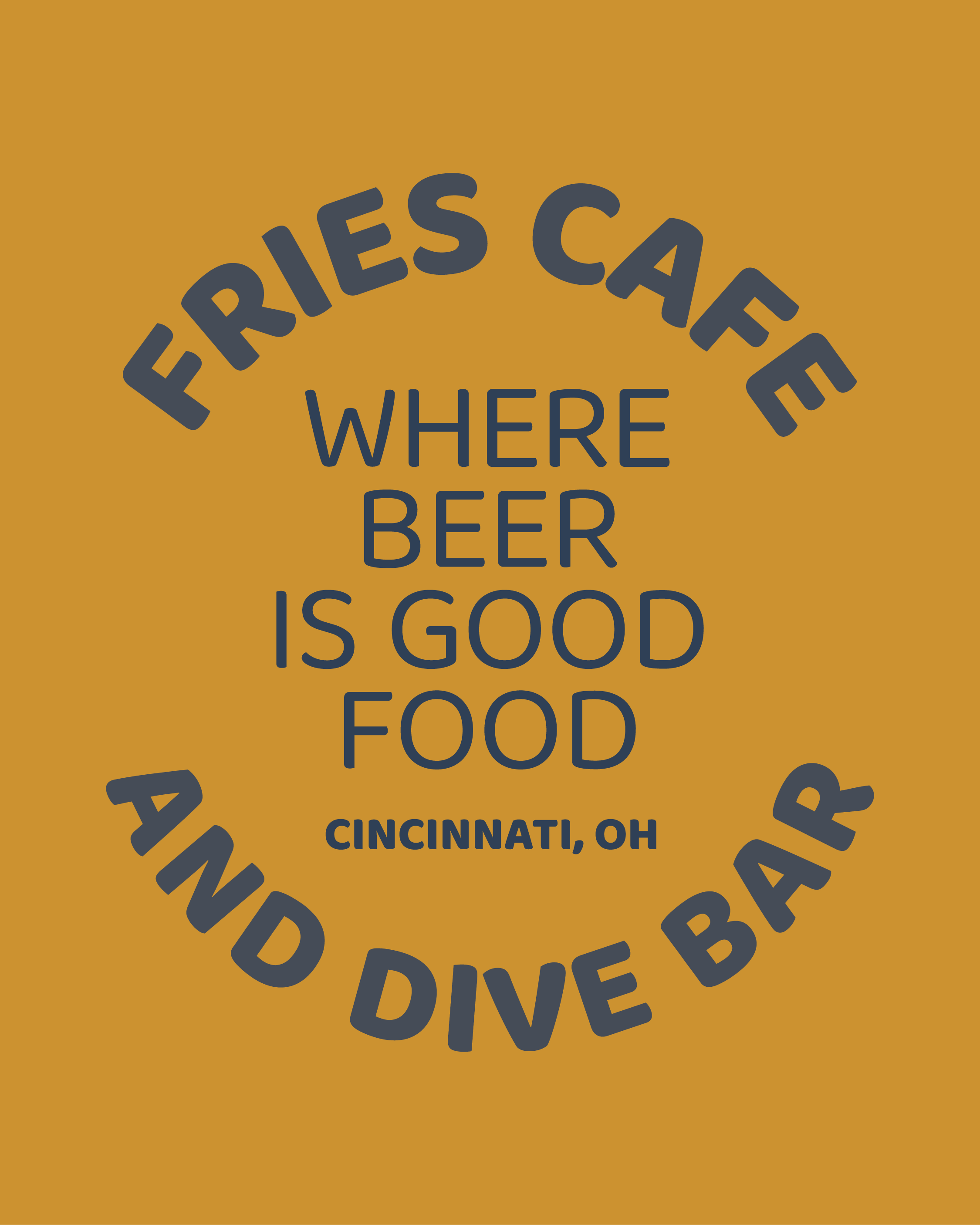
Nestled in the heart of Clifton, Ohio, Fries Cafe has been a neighborhood staple since 1930. Known for its dive bar charm, iconic shuffleboard, and storied past, the bar has long served as a gathering place for University of Cincinnati students, regulars, and local legends alike. But like any good story, it was time for the next chapter. When new-owners Rich Kadel and Laura Weir told me they wanted a full rebrand, I was ready to deliver.


BREATHING NEW LIFE INTO A BELOVED DIVE
When I was approached to lead the rebranding of Fries Cafe, the goal was clear: honor the history while making the brand more cohesive, versatile, and recognizable. At the beginning, there wasn’t even an image of the current logo. This was a start-from-scratch situation, and I was so excited to jump into the logo development.
EXPLORING THE LOOK: 2 CONCEPTS

Before landing on the final logo, I presented two distinct directions to the owners, each rooted in the spirit of Fries Cafe but told through a different lens.
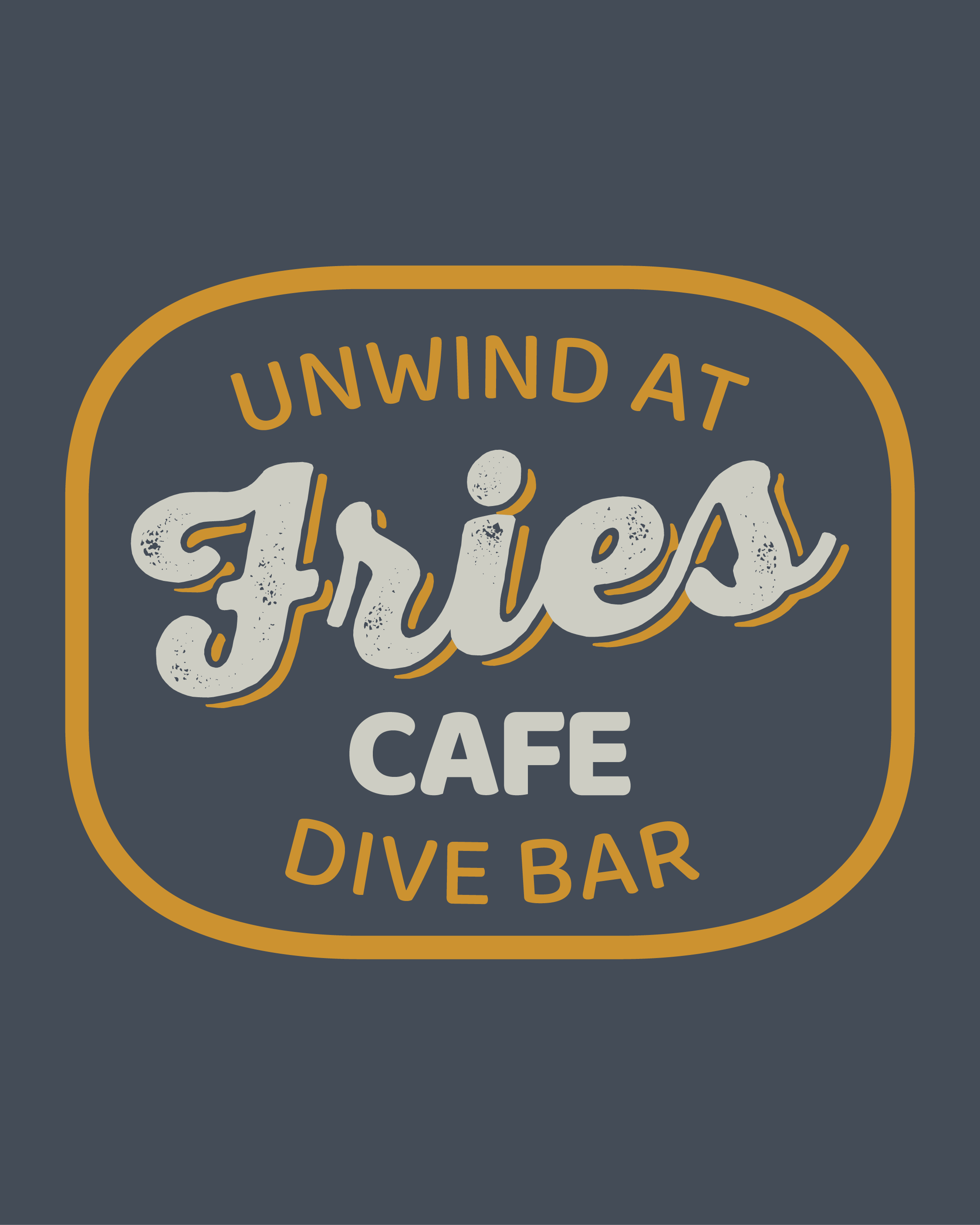
“Last Call”
A gritty, script-style “Fries” paired with a clean, sans-serif “Cafe” for contrast. This concept channels that raw, dive bar feel with a hint of polish — think worn leather booths, low lighting, and jukebox classics. It’s the vibe of “stay ’til they kick you out,” and it’s the version the owners ultimately chose to represent the brand.
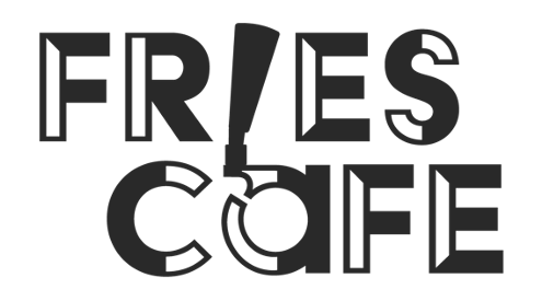
“On Tap”
A bold, memorable wordmark with a clever twist: a beer tap used as the “I” in “Fries.” This playful element became the centerpiece, designed to be iconic and instantly recognizable. While it wasn’t the final pick, it served as a strong creative exploration of the bar’s identity.
THE CHOSEN ONE: “LAST CALL”
The chosen logo is a modern take on vintage signage. After landing on this style, it was time to create a few logo iterations paying homage to the old logo styles from bars during Prohibition. Fries actually has an underground space that was used as a speakeasy during the final years of Prohibition.


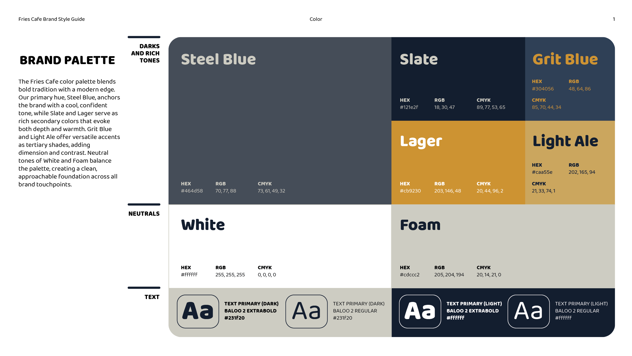
COLOR

consistency wihtout conformity
This project is still ongoing so there are so many things that could change, but I’m loving every moment of it. I’ve been working on a style guide that brings it all together — a roadmap for using the logo, colors, typefaces, and imagery with clarity and consistency. It ensures the Fries Cafe brand can grow without losing what makes it so unique.